Illustrious commenter
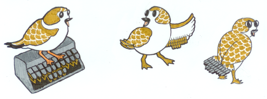
Sonja wrote me last night with an exciting development. She has a friend who's an illustrator, by the name of Laura Lake. Sonja told her a little about the project and asked if she had any ideas for a logo. Look what she came up with!

I'm a huge fan of the one on the left, but Laura's favorite is the one in the middle. What do you guys think?

4 comments:
We've got another vote for the one on the left.
I like them all, but I love the one on the left with the plover sitting on the steno keyboard.
I got a vote for keeping all three together, but with Tony's vote, we're getting pretty close to consensus for the one on the left. Not that I'm biased or anything.
(Okay, I totally am. I love that little dude.)
OK, I've gotta be different, but I really like the middle one. I think the one of the left is cute but I don't know, I'm just drawn to the middle one.
Post a Comment